FlyUX: Airline Mobile App
Background/Task
Fly UX is the name of a fictitious start-up airline from the brief given to complete the UX Design Institute Professional Diploma. This was an individual project to design a mobile app for Fly UX which focuses on the flight booking process; specifically how users search for, find, and select flights. The journey starts with the landing page and concludes with seat selection. Add-ons such as car rental, transport options, and hotel booking are not included.
The end goal was to design and build a clickable prototype that can be tested with users, along with a detailed set of wireframes. We were encouraged to research existing airline and booking apps to identify areas for improvement, and understand what worked well, so we could learn from these insights to create an online experience that is fast, easy, and intuitive: one that is based on a deep understanding of their target users and their needs.
My role
User Experience & Research Designer.
Activities
Research, usability testing, note taking, surveys, design, wire-framing, prototyping, personas, affinity diagram, competitive study, information architecture, user flows.
Tools used
Figma, Reflector3, Typeform, Adobe InDesign.
Results
I received an overall result of 92% (Distinction) for my full project and exam.
The finished prototype :
The Process
This project follows the typical UX design process: Research, Analysis, Design, Prototyping and Wireframes. After prototyping, I would revert back to design, prototype again based on usability testing, and continue this cycle until the final version is perfected. Only then can the wire-framing begin. For this project the structure remains mostly linear.
Competitive benchmarking
In order to learn and explore how best-in-class websites and apps solve a similar problem to the one I was trying to solve for FlyUX, I chose four apps to review; Aer Lingus, British Airways, Emirates and Irish Ferries (the non airline, but travel related wild card). My goal from this research was also to understand the conventions we should follow and highlight best practices which I could emulate.
I investigated three categories: 1: Homepage (Is the prop clear?). 2: Search and select (Key functionality). 3: Entering details.
These were my Key Insights:
Homepage:
Make your main proposition/call to action bright and clear so users can find it quickly and easily.
Keep the homepage clear and simple; do not clutter the interface with distractions such as busy/non complimentary imagery, ads or too much information.
Highlight, don’t hide secondary functions such as Login/find Booking.
Search and select: This was more of a study on what not to do based on the things I found confusing/frustrating.
I learned to make sure that hierarchy and structure/layout are treated as crucial considerations in the design approach, and to avoid any ambiguity or clutter which adds to confusion for the user.
Be selective with colour, with accessibility in mind.
Include an option to set your departure airport to ‘Use my current location’. Only display available flight dates to save time/frustration.
Clearly distinguish between outgoing and incoming flight dates.
Make use of ‘recent search’ to save time for returning browsers.
Entering details:
Pay particular attention to rules and validation for entering personal details like email address, phone number etc.
Don’t add unnecessary fields for mobile to save extra taps.
Give a checkout as guest option, or option to quickly register using gmail/facebook etc.
Use a progress indicator to show how much work is involved in the form filling and feedback on completed stages.
Display flight information and prices clearly.
Use friendly language.
Usability Testing & Note taking
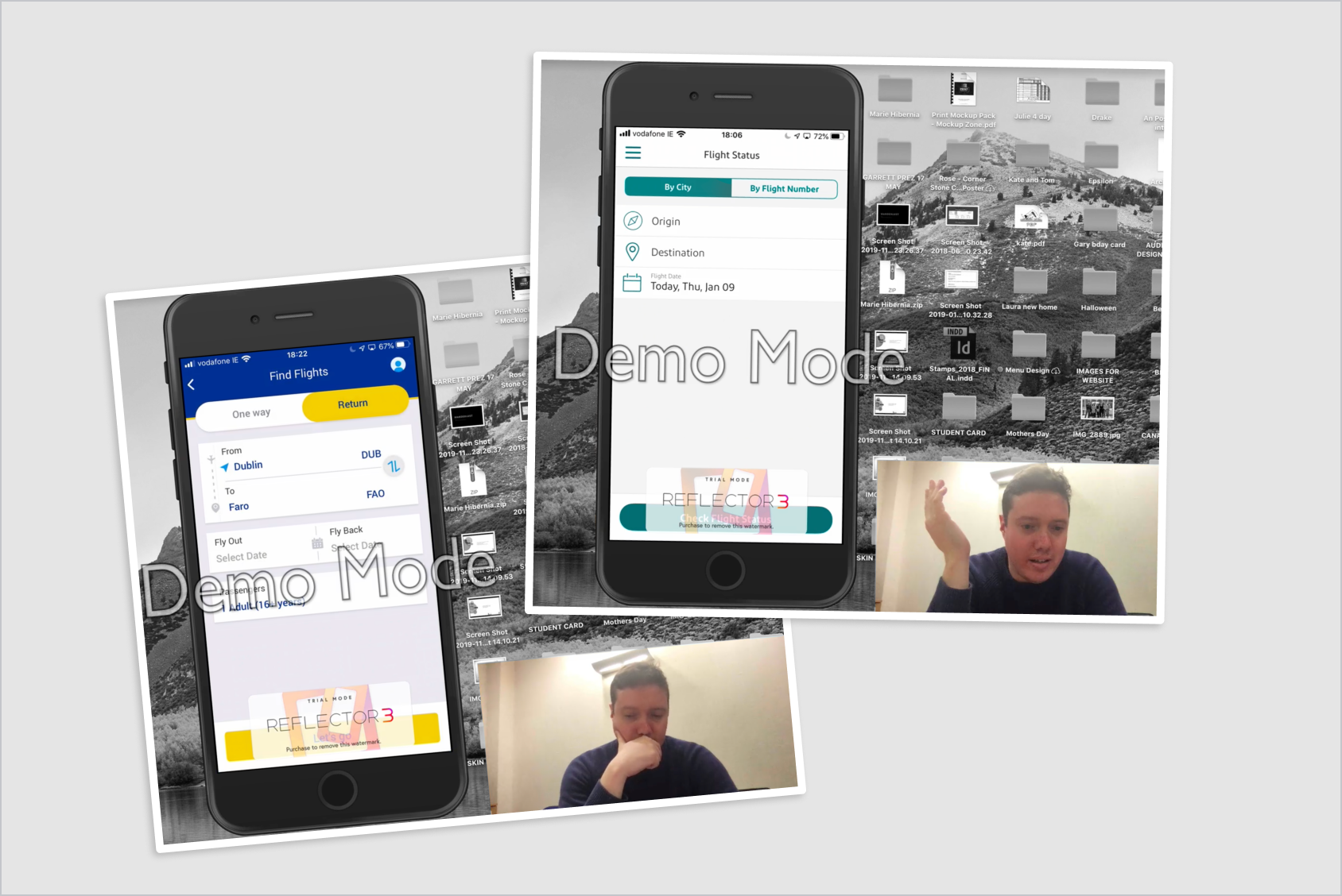
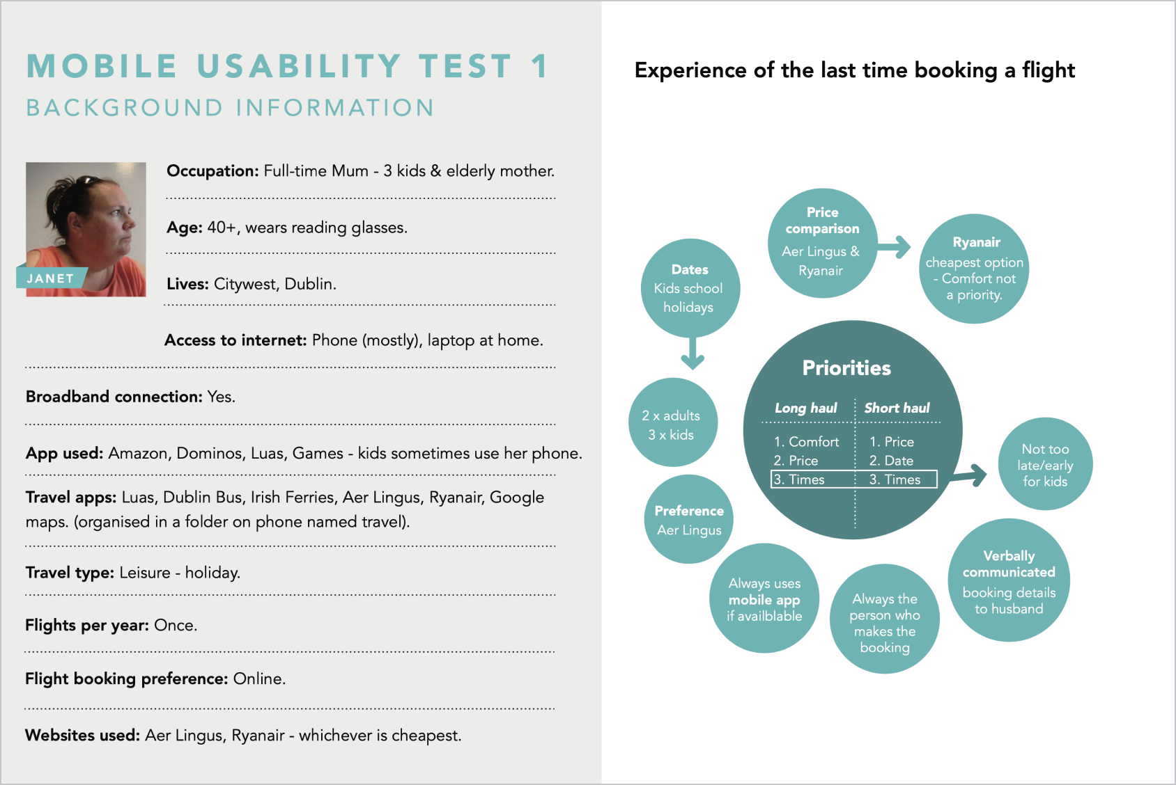
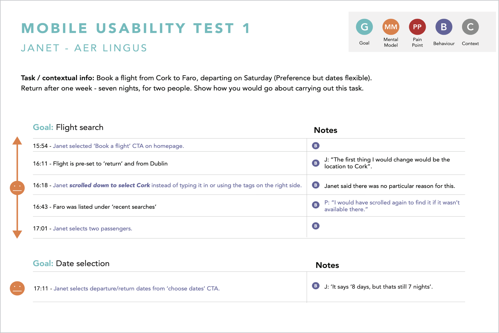
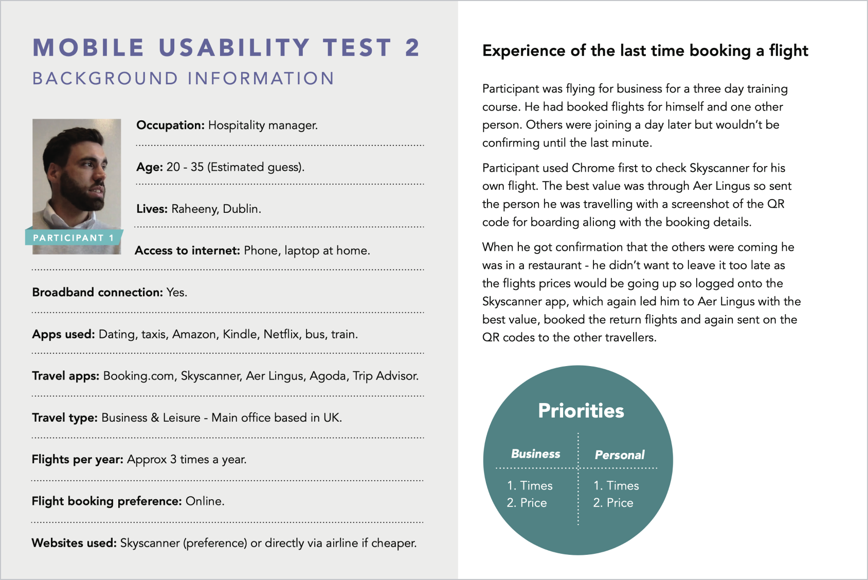
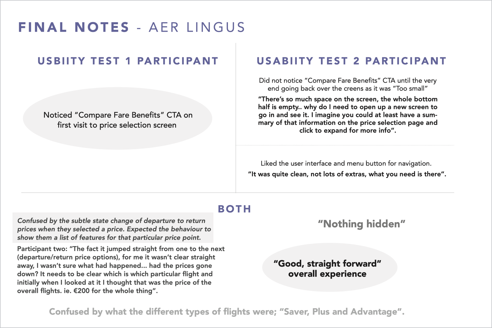
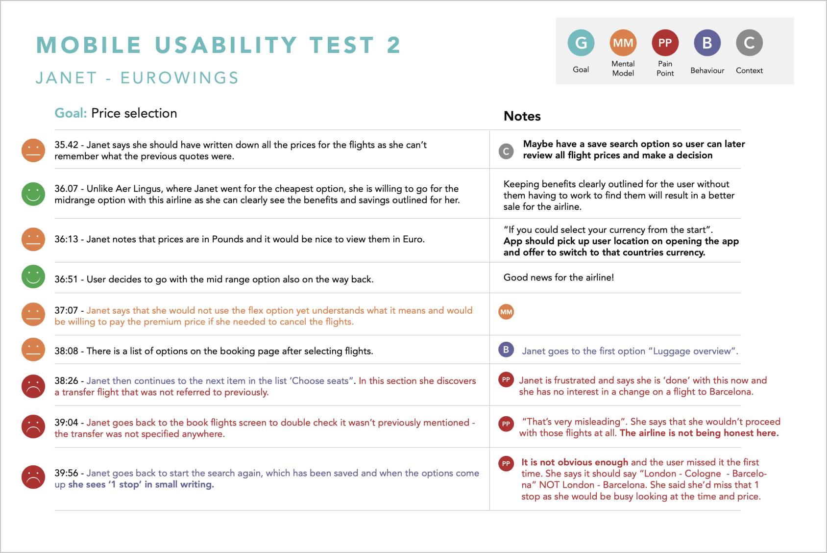
Task: In place of a prototype, as my app had not been built yet, I used my competitors’ apps for my user testing to determine which features were and were not working well. The apps I tested were Ryanair, EuroWings and Aer Lingus. The UXDI provided me with two pre-recorded usability test sessions, where each user tests two different apps. I also conducted one usability test session myself, using the Ryanair app. My objective was to learn as much as I could about the goals, context, behaviours pain points and mental models. of airline customers when booking flights.
Context: The users were asked to book a holiday for two people, travelling from Dublin to Faro (Portugal) 7 nights in total, and the flight was to be booked with hand luggage only. There was a flying window of 10 days to allow for a more flexible booking experience, and to determine what matters to users most when booking i.e. flight times, price, additional legroom during the flight (seat selection) etc.
Customer journey map
I then created a Customer Journey Map to define the high-level steps in the booking journey. Each step documents the users’ goals, any pain points, mental models and behaviours.
From the previous research I assessed each steps overall user experience and marked the steps with smileys. Any step that wasn’t placed in the top of the customer journey map shows an opportunity for improvement in the new app’s overall flow.
Affinity Diagram
Next I created an Affinity Diagram to divide and categorise the data I gathered from the survey and usability tests, making it easier to spot patterns, pain points and areas for improvement.
Flow Diagram
The objective of the Mobile Flow Diagram is to improve on the issues and pain points that I uncovered in the research and which were highlighted in the Customer Journey Map. By defining a high-level flow for my app, I can address each issue and create a flow that is more dynamic and user friendly.
I started with the main steps in the customer journey and gradually expanded each section with screens and screen states. One of the key take aways from my research was that users want simplicity in the booking process, so I categorised the different steps with colours to get a clear visual representation of how many actions or screen states there are for each step.
Interaction design
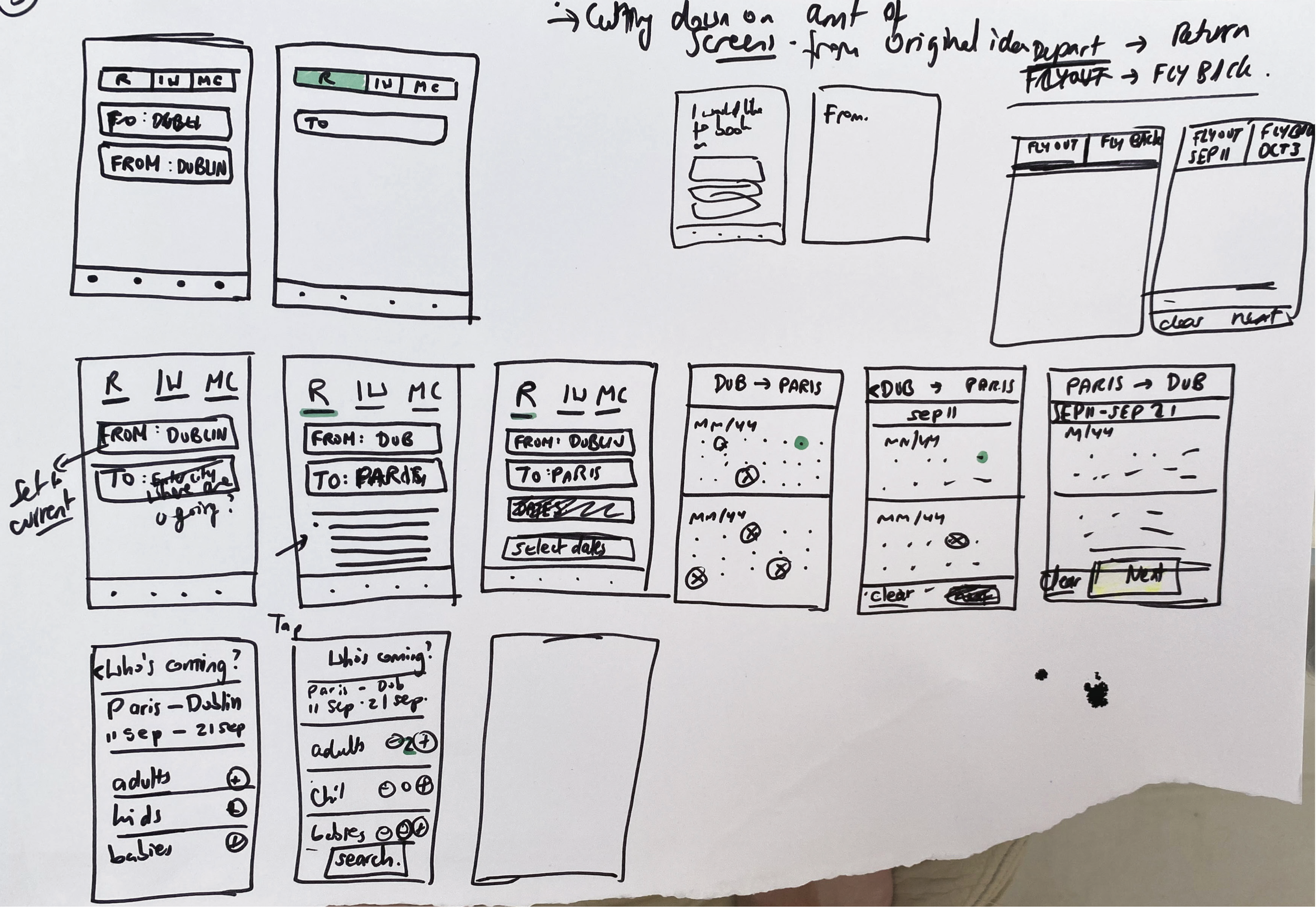
The flow diagram provided a good framework from which I could sketch a low-fidelity prototype. Using a pen and paper, I developed many iterations of the high-level content that was expected to be on each screen. I tested my designs on three users and based on their feedback, made revisions until I arrived at a final low-fi prototype I was satisfied with.
Wireframing
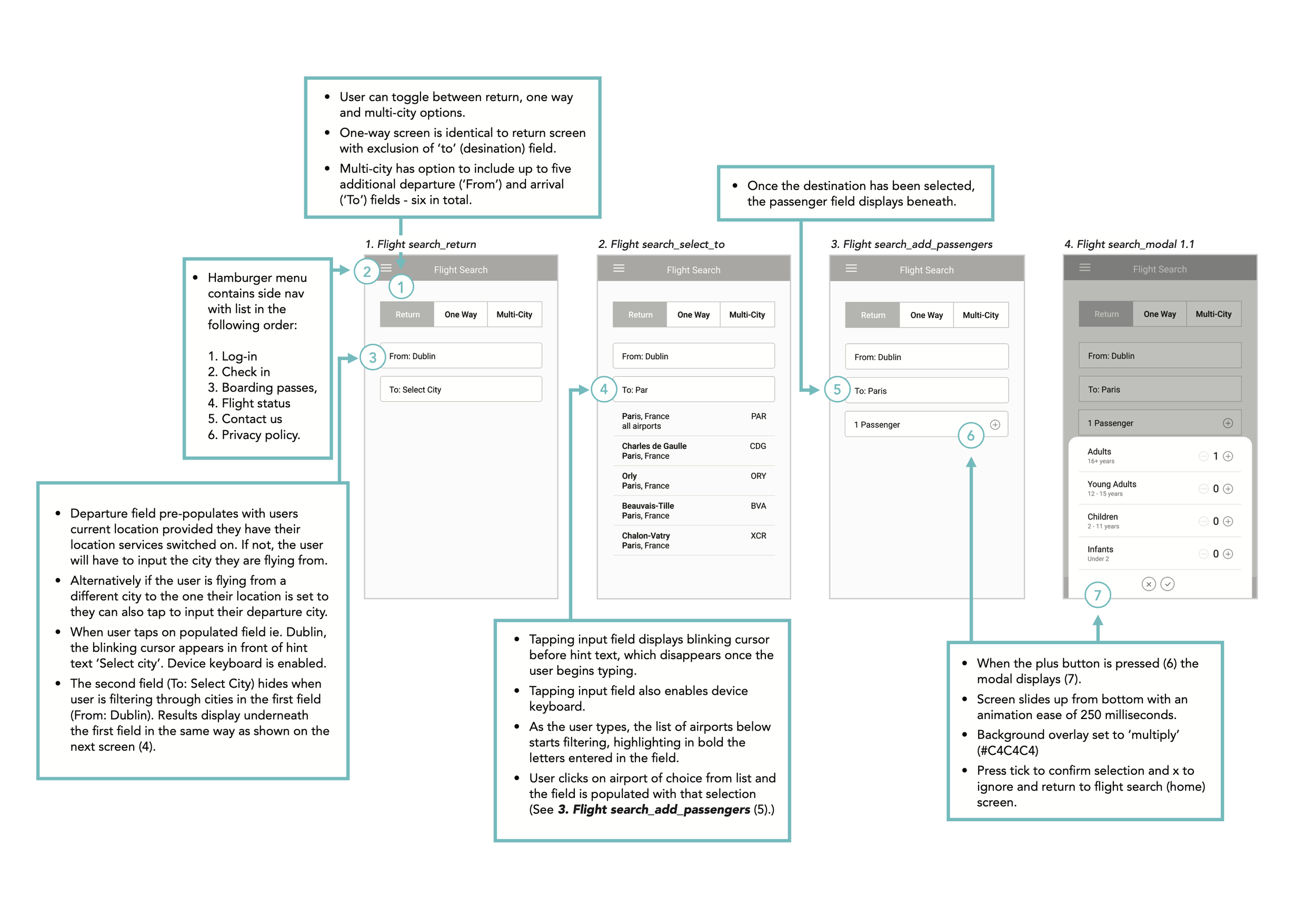
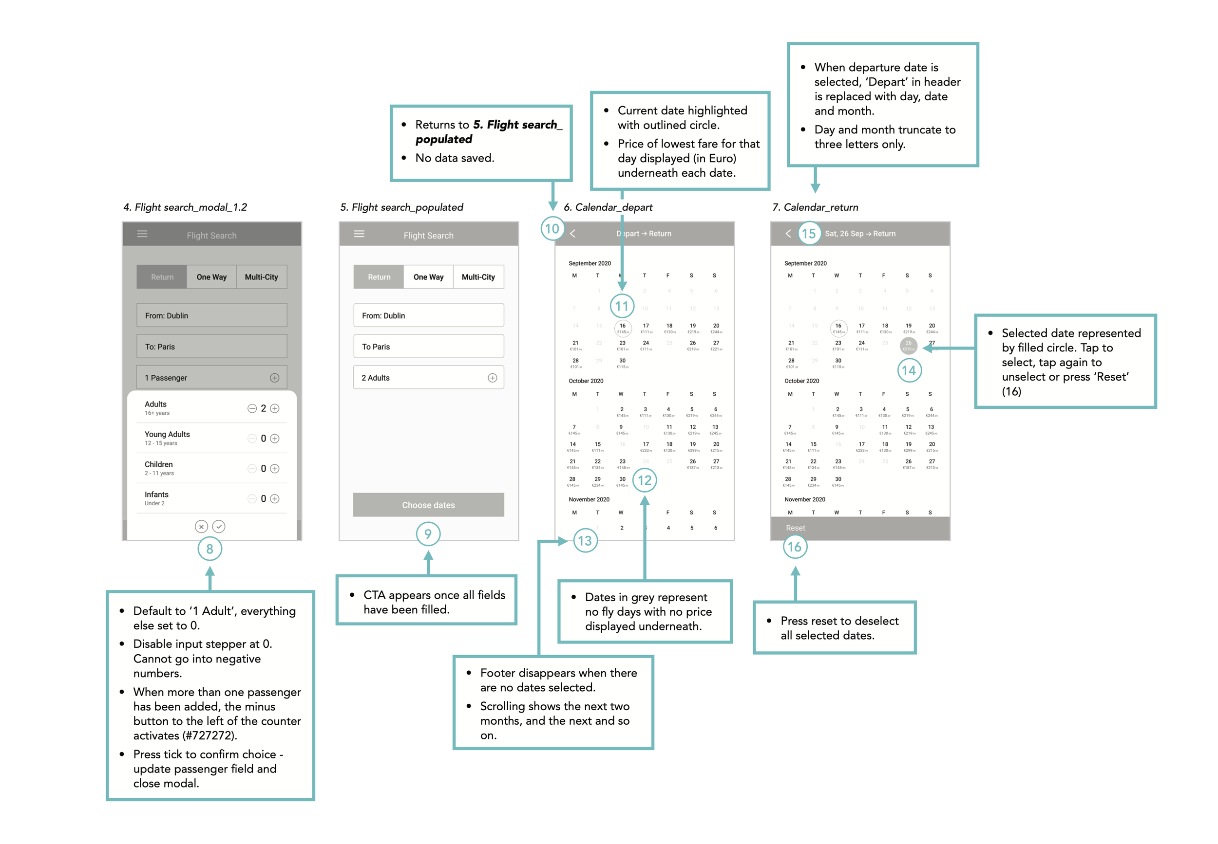
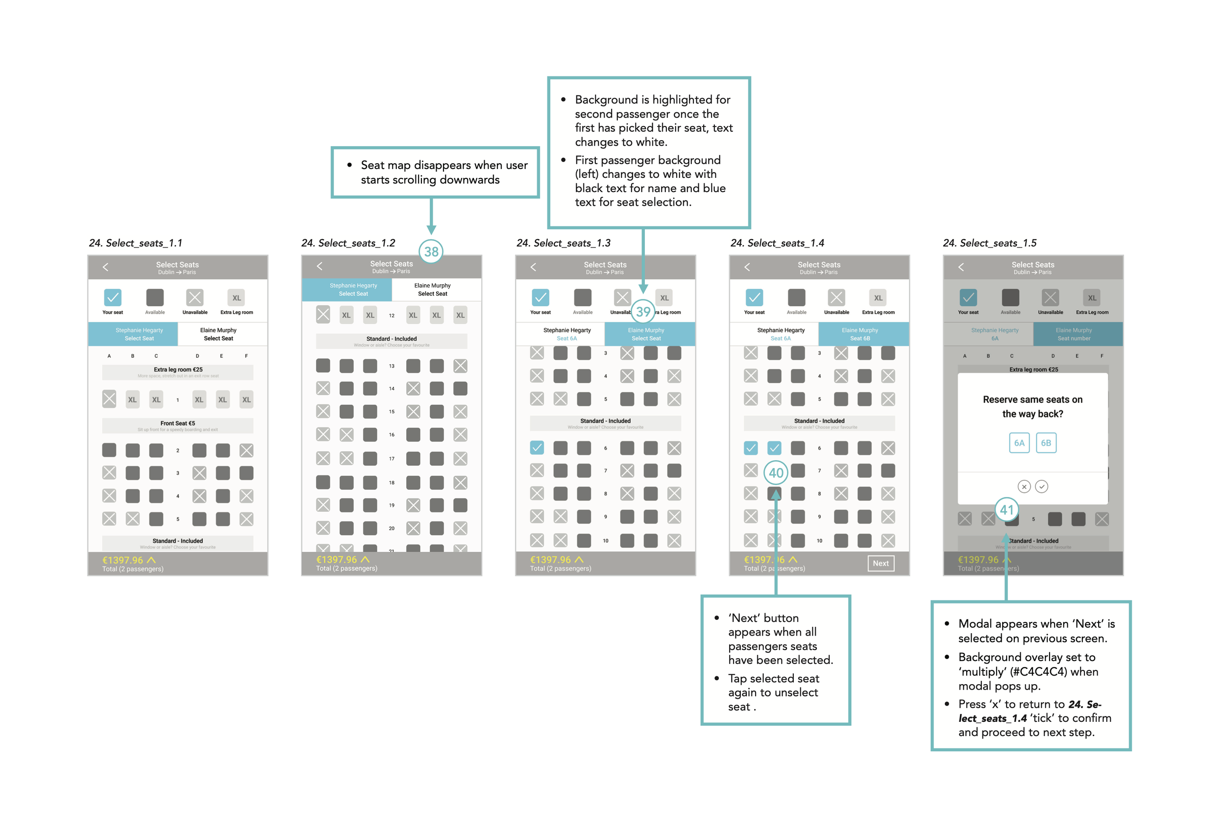
The final piece of this project was to create a handover document containing a detailed set of annotated wireframes to define rules, feedback and actions for the developer to build the app accurately.
