Return your Online Shopping
Hassle Free with An Post
As a result of the Covid-19 pandemic, more people than ever started shopping online resulting in a 159% increase in Irish online revenue year on year since 2020. With that, there was a need to provide An Post customers with an easy way to return their online shopping from selected retailers via anpost.com.
Team: 3 UX/Product Designers (1 Principal, 1 Senior & 1 Junior) and one Front-End Developer.
My role: User experience & interface design, quantitive research, user testing, interaction.
Activities: Research/problem discovery, wire-framing, mock-ups, full spec treatment and prototyping.
Tools used: Figma, Google Analytics, Axure.
High-Fidelity Prototype
The Problem
In 2019, An Post introduced a simple step by step form flow that allowed users to select the the retailer they ordered their shopping from so they could return their item, and then choose whether they would like to drop it off at a post office or have it collected. This product has serviced over half a million unique users every year to date.
However, in the 3 years since the tools’ introduction, An Post have grown their number of supported retailers and the existing solution has struggled accommdate this scale as result, leading to basic usability principles being challenged.
Discovery Phase
At the outset of the project, early discussions with stakeholders / product owners made it clear that there were not any pre-existing insights/research that identified specific problem(s) aside from their own superficial reviews.
Overall, the general consensus from stakeholders was that they wanted the tool to have the ability to scale as they continued to expand on their list of supported retailers, whilst being easy for An Post customers to use.
Early stage User Testing
Due to the lack of pre-existing insights, we began conducting early stage moderated, think-out-loud user tests on the live site. The objective of these tests were to identify pain points throughout the journey.
We gathered an initial test group of 10 Users, all screened with a set of open-ended questions to validate their eligibility for test. The questions included:
How often a week would you shop (and purchase) something online?
How often would you return items and if so for what reason?
How would you typically return something? Tell us about the process.
Have you ever returned anything via the An Post website before?
We wanted a set of initial testers that were frequent shoppers and therefore had varied experiences of returning items to different retailers. It was also essential that they had never used the An Post returns tool. Each tester was given a scenario where they had purchased some Item(s) online and needed to return them. Testers were also given different retailers so we could observe how they utilised the existing retailer dropdown.
Pain Points
A Long List
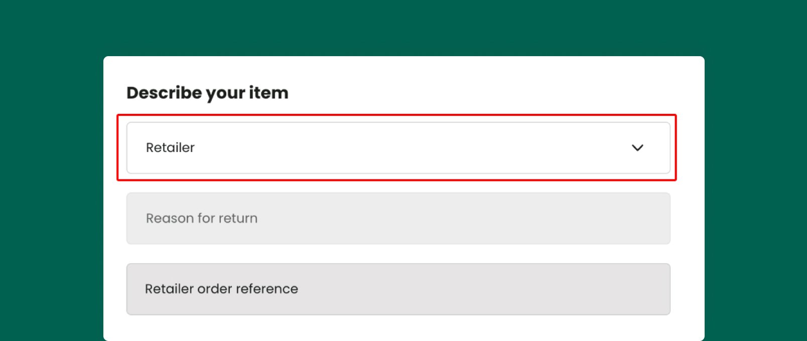
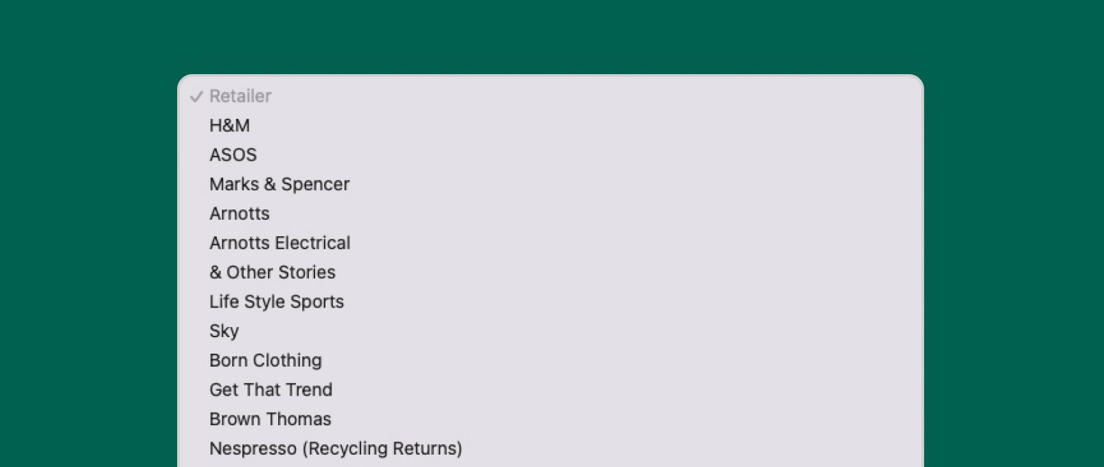
During the tests, each user was given a different retailer to select. We wanted to gauge their reaction to having to manually browse for a particular retailer using a dropdown with 156 different options.
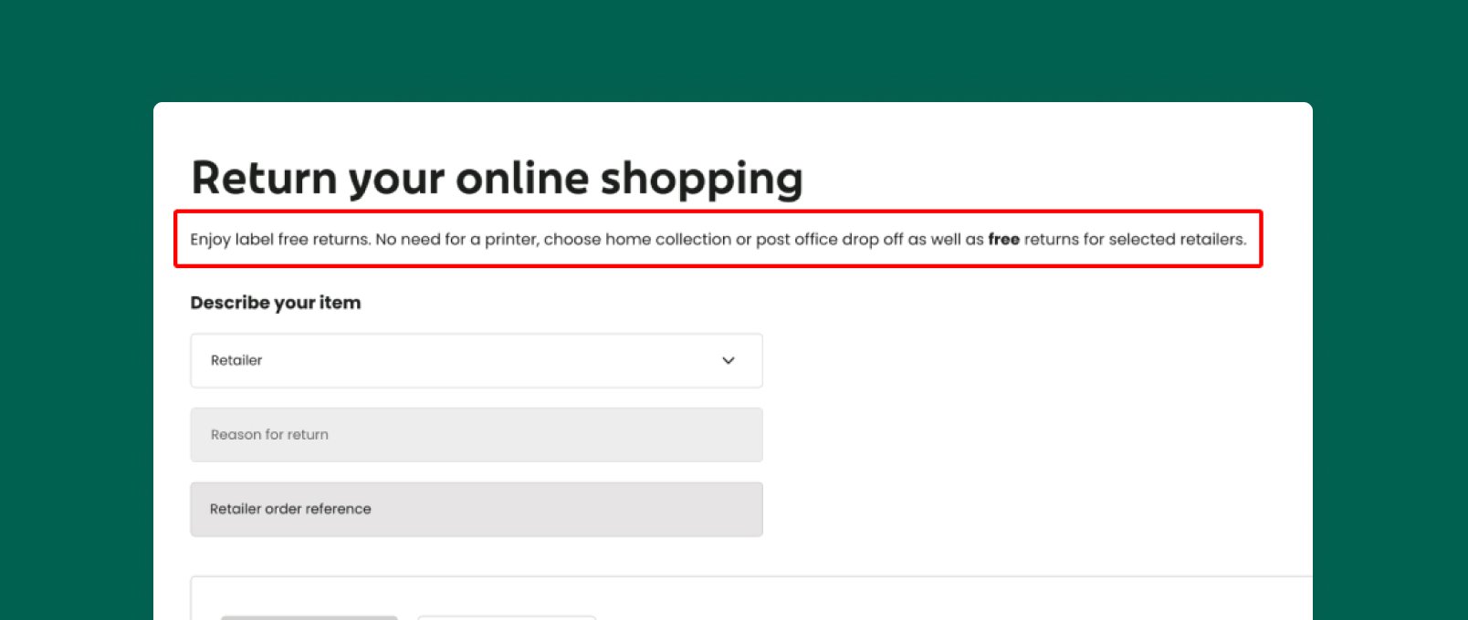
No One Read The Value Proposition
One thing that was clear from the user tests was that no one read the instructional text above the form; this text provided important information to the user as to how the service worked - we assumed this missed information led to confusion later down the journey.
Confusing Hierarchy
In the tools existing form, retailers were organised by most commonly used first, then the remainder of the List was alphabetical. This caused particular confusion amongst testers who were given retailers such as “Nespresso” which they assumed to be at the bottom of the list.
“Add A Label” Confusion
One discovery we did not anticipate was that 7/10 of the testers became confused when arriving on the basket page and being confronted by an “Add a Label” CTA.
Due to earlier observations that users skipped reading the instructions, most users were not aware that this was a label free return, and hence most assumed this was the correct next step in the journey.
Observation Summary ✍️
Our observations from the User tests were as follows :
Most testers expressed frustration with the long retailer list and confusing list hierarchy
All testers ignored or skipped the instructional text/value proposition
Most testers misinterpreted the “Add a Label” CTA as the correct next step
Validating Qualitative & Quantitive Data at Scale
Retailer Dropdown:
Alongside the click data supplied, I also reviewed 50 recorded sessions and logged the timestamps between the initial click into the dropdown and the selection of the retailer. I then noted whether it was a “top” retailer or a retailer that was listed alphabetically. The median time to select a “top” retailer was 7 seconds, and the median time for other retailers was 12 seconds. This did not suggest that the qualitative data was wholly supported by the wider quantitive data.
However, the following became evident:
People using this tool already knew what retailer they needed to find.
That a dropdown list of 156 retailers was poor for usability & could not scale endlessly.
The goal was clear - Help users find their desired Retailer Faster
Instructions Text
This was something that could not be easily corroborated by any data other than think-out loud user tests, even with Glassbox recorded sessions, it was hard to confidently assess whether users were actually reading and absorbing the instructions. It was only from the user testing that we observed that all testers ignored or “did not see” the instructional text.
The Goal for this aspect was - Help users understand how the service works.
“Add A Label” Basket CTA
Perhaps the most unexpected and impactful discovery that came out of the user tests was the confusion/Failure rate as a result of the “Add a Label” CTA at the basket step. This was something that was incredibly easy to verify at scale using both Glassbox recorded sessions and Google analytics.
Google Analytics painted a clear picture that an average of 25% of users month on month were leaving the basket page via the “Add a Label” CTA - of this 25%, around 50% of users would immediately return back to the Basket page which lead us to assume with some confidence that these are users who went down the wrong journey but realised before they took any further action.
In our user tests, some of the testers persisted down the incorrect journey all the way to the end before becoming completely stuck. Glassbox screen recorded sessions also demonstrated the exact same behaviour patterns as those in our moderated user tests i.e. Users would reach the basket, pause for a few seconds then click “Add a Label”, again some would go back immediately, however some would continue on down the incorrect journey until they eventually realised and went back.
The goal from the above became - Help Users easily complete their return.
Defining the Problem
After validating our observations and findings from our User tests at scale using analytical tools, we established the goals and now we could frame those as a problem definition which would form the basis of our ideation and solution for the project.
Ideation & Sketching
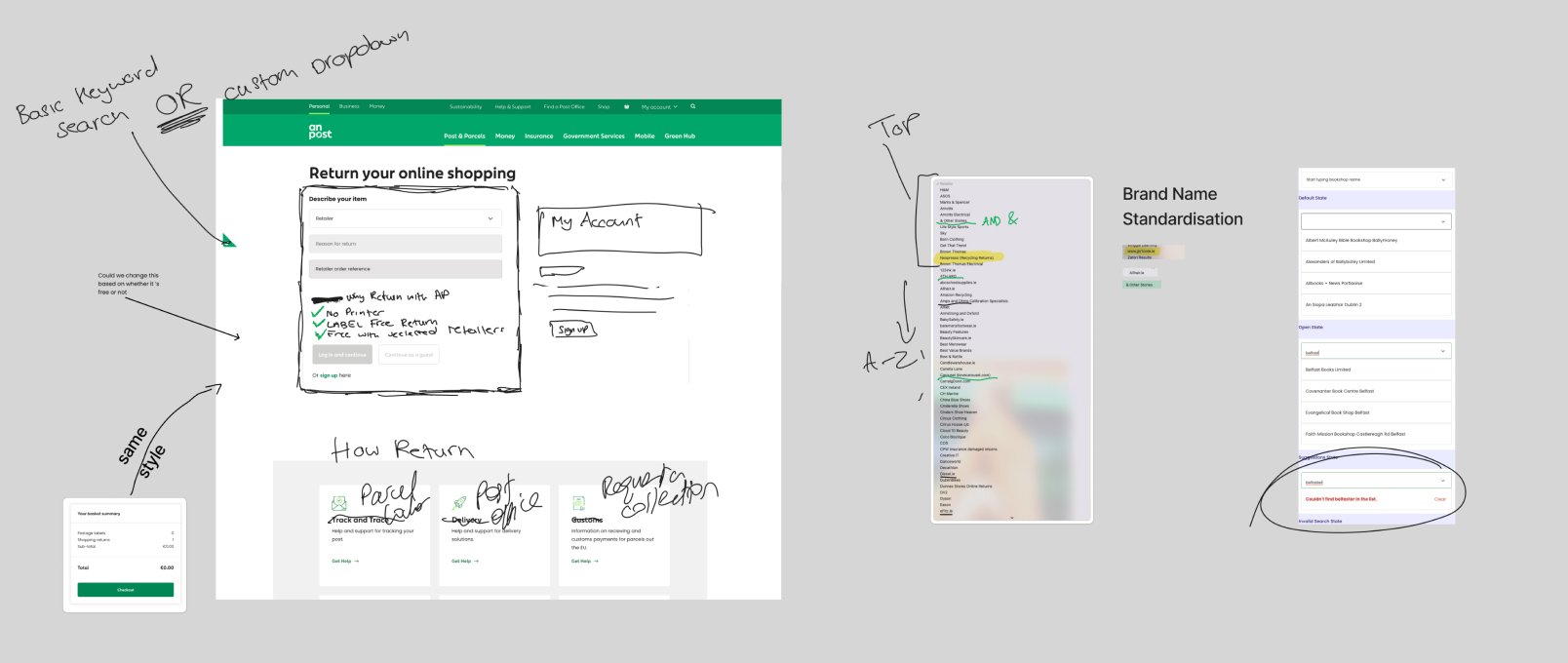
Once we had our problem definition and our validated user research data, we got together as a team (3 UX / Product Designers (2 Senior & 1 Junior) and one Front-End Dev) and conducted an a remote ideation session via Figjam.
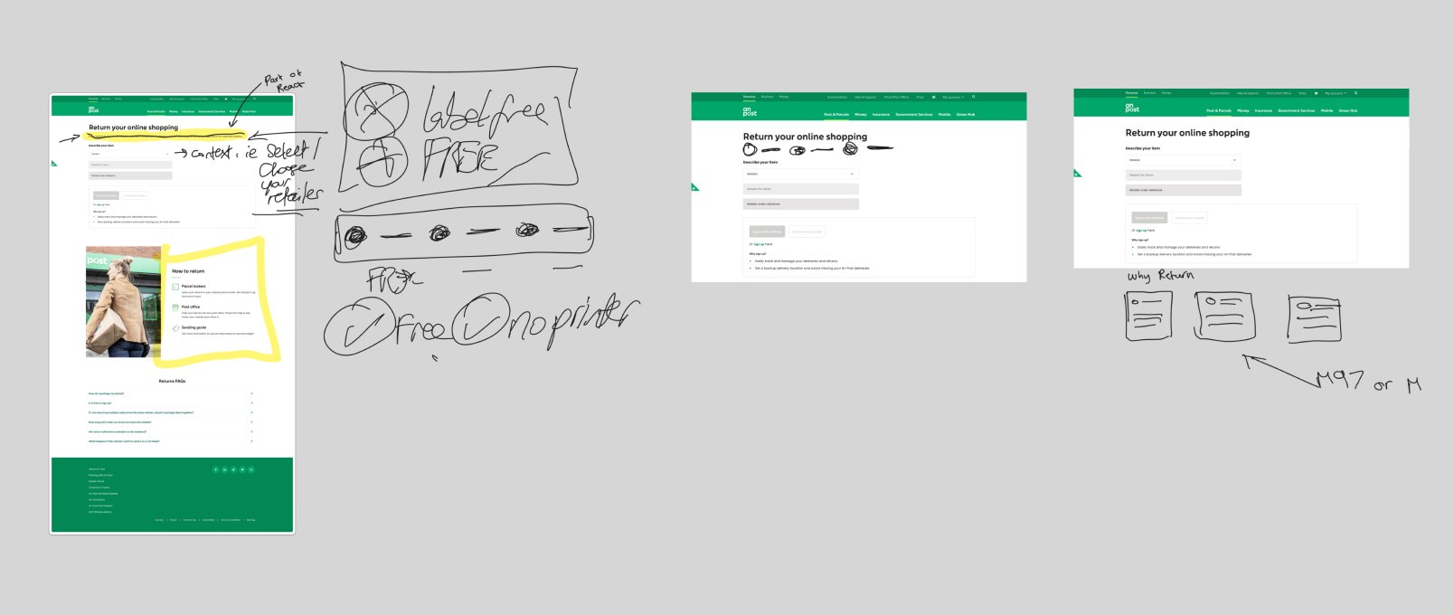
Below are two examples of our quick, rough, yet effective collaborative sketches made during our ideation sessions. Our aim during these sessions are not to finalise neat sketches or wireframes, they are a chance for everyone to scribble down any thoughts or ideas in their heads, including the devs.
This not only creates more innovative ideas from the team as everyone is encouraged to participate but by not being precious about the quality of our sketches, we generate ideas rapidly that we can then evolve in the design process.
Prototyping the search
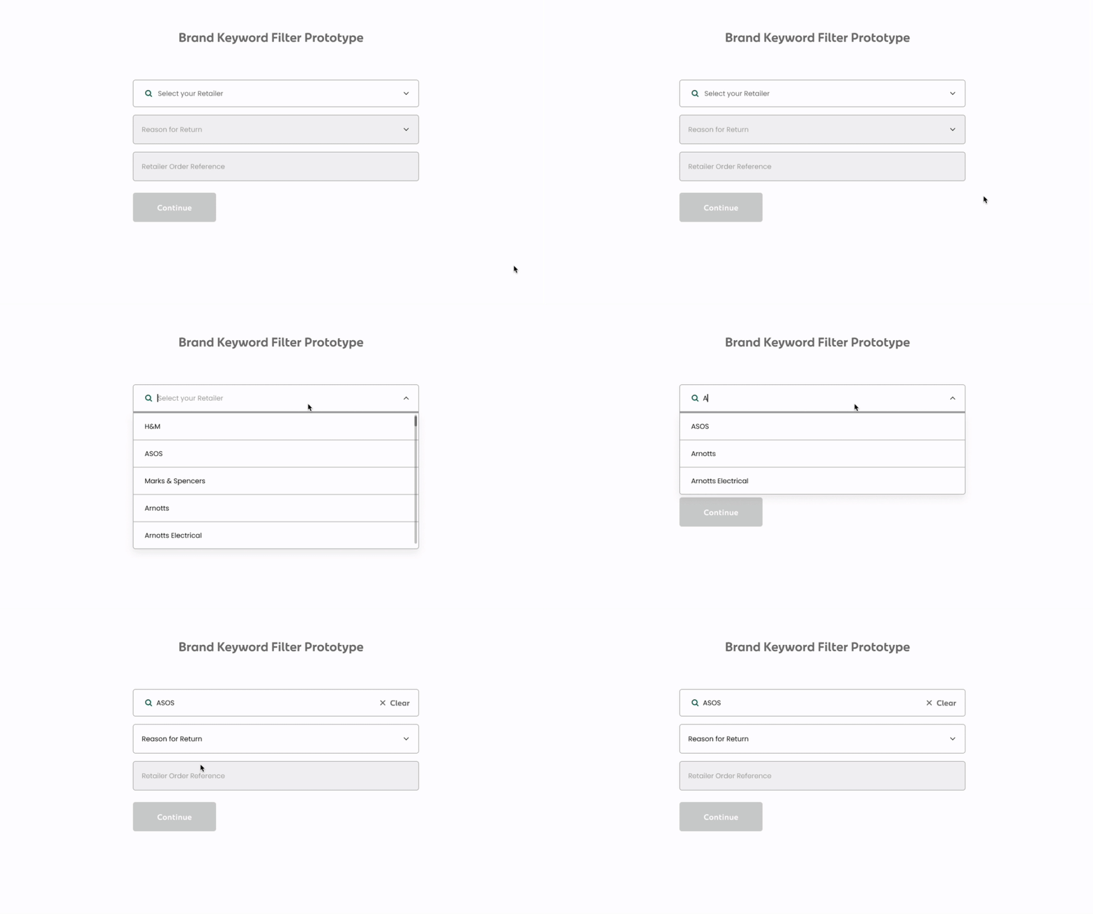
One of the immediate outcomes of the ideation session was to replace the current retailer dropdown with a hybrid search/dropdown. I began working on creating a rapid prototype to test how this functionality would work.
The Challenge - Prototype 1
Unlike traditional search functionality, this particular flow had additional fields below. These fields had conditional logic as well which further complicated it. eg. ASOS may have under Reasons for Return; It does not fit, whereas Nespresso would obviously not have this reason for return.
For this reason, this meant once the user had selected their retailer and interacted with the 'Reason for Return' field, there had to be something in place to stop them changing the retailer.
Considerations
Why did the field retailer need to be locked in the first place, couldn't the whole experience just be reset once the user interacted with the Retailer field again?
No, because for us that broke a clear usability heuristic - visibility and feedback. The User for whatever reason may not intentionally want to change retailers, and therefore could become confused and irritated by having their entire process reset for a seemingly simple mistake.
Guerilla Testing
Before progressing with this any further, I was quick to test this simple 3 step process with a few friends and family - it was essential to me that I had validation before proceeding with this concept.
Concept of an upsell in the error handling message.
However I proposed adding an upsell link to the 'Click & Post' service at the end of the error message.
This would aim to drive users searching to return items from an unsupported retailer to the paid digital postal service.
Demonstration of the Clear / Reset functionality
I conceptualised adding a 'Clear' option that would become visible once the User selected their retailer, and a 'Reset' option which would become visible once the user interacted with the 'Reason for Return'.
Fortunately I was able to validate that most of those who tested immediately and intuitively understood the concepts of 'Clear' and 'Reset' within the context of the search.
Error Validation
As with any product flow, I had to anticipate and manage expected user errors. There was data supplied to us at the beginning of the project that Users were using the general site search to look for brands / retailers, specifically ones that were not supported through the An Post returns tool.
An invalid retailer
Now, there was a potential upsell opportunity in the error handling. Simply telling a User that a retailer is not valid will likely end their journey right there and then.
Invalid String
Another error case was if a User attempted to exit out of focus state on the search field with a partially typed string. For example, instead of 'ASOS', the user only typed 'ASO'. It was essential we alerted users to spelling mistakes as well as the spelling of Brand names is not always intuitive.
Partially typed string error handling concept.
Refining the User Interface
Once I was supplied with the pre-approval UI concept, we got together and decided on areas to refine it. Through a short collaboration session, we were able to bring the UI concept closer inline to what we had as a shared vision.
Please refer to the top the page to view the High-Fidelity Prototype. With the search prototype added into the refined UI concept, we now had a fully functioning high-fidelity prototype that allowed us to test the end-to-end flow of the journey.Note - you may notice that some of the fields in the prototype seem to autofill. This was an intentional prototyping decision to reduce the amount of time spent on prototyping, certain things like HTML selects and other fields would be autofilled - something we explained to testers in later stages of user testing.


