An Post ‘Contact Us’ Page
Improving self-serve & reducing call volumes
Business Justification: The contact us form (email) is the slowest way to get an answer from customer services, and data is showing that after completing the form, customers will get in contact a different way ie. phone when they don't receive a prompt response to their enquiry. In this case, the An Post Customer Service team are spending time answering emails where the customer has already gotten a response, which is a waste of resources.
Team: One Product Designer (me), one Front-End Developer and one Product Owner.
Activities: Research/problem discovery, wire-framing, mock-ups, full spec treatment and prototyping.
Tools used: Figma & Google Analytics.
Final page design:
www.anpost.com/Help-Support/Contact-Us-(1)
Acceptance Criteria
Image: The An Post Persona I used for this project; Ciara.
Guide customers who arrive on the ‘Contact us' support page to the fastest and most appropriate channel to find the answer to their question(s). Encourage them to self serve via FAQ, Chatbot or Live Chat if extra assistance is required.
Promote the top FAQ's and highlight Live Chat/Webchat as being the best ways to find information/engage with the Customer Service Team and continually reduce the volume of customers using the contact us form option as a channel.
Reduce visibility of the contact us form option on the page, and if customers do select that channel they are given a response time estimate.
Agile: Implementing quick, easy improvements
Ahead of commencing the full page review and redesign, I completed a brief, high level design review and then sat down with the stakeholder to brainstorm some ideas that would enable us to make small design improvements which we could implement quickly through Kentico, our CMS platform, and hopefully start to see a difference in contact centre metrics whilst I worked through the new page design, hand over for front-end work, then stage, test and release to the live website; a process which would take a few weeks.
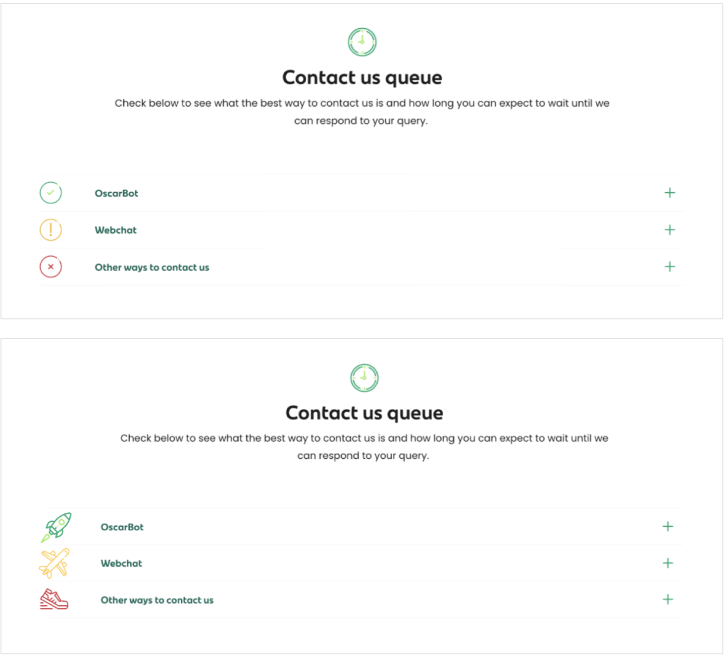
The video displays the mobile view, and the other two graphics were part of my design iteration process for this idea.
The first page is how the original page looked; the second page is with added timer icons using a traffic light system to communicate to users how long a response they should expect.
Measuring the Impact
The charts below demonstrates that signposting more efficient channel options changed customer behaviour. Over a four week period, there was a 20% decline in customers submitting the form after they come to the contact us page.
Back to the Redesign
As anpost.com is built using modules, I always check our design pattern library first for suitable design components to build my page, or at least as a starting point. I then explore expanding existing functionality to see if that approach will solve my design problem. The images below show my research, design, and UX copy writing exploration in Figma.
Multivariate testing
We put the two new designs below live to test for a period of 35 days using a multivariate approach against the the original page. They were named Control, Variant, and Contact Us Form Variant.
DATA TABLE 1 : Based on a 95% confidence level, the variant (New design) has won in reducing form submissions ie. Email submission rate by a total of 9% - from 16.9 % to 7.9%. Achieving the main objective of the design work.
DATA TABLE 2 : In terms of other interactions on the pages, this is not exactly representative of users clicking on various links on the page and then navigating to other pages as they could have landed there in other ways, but all in all, the data shows that those who couldn’t find the email form gravitated towards web chat on the variant - also fulfilling the criteria and deeming the new page a success.


